Nationally, new home sales hit their lowest point since 2009, putting pressure on Lennar to move excess inventory. Their existing digital solution, lennar.com, was designed for owner-occupants, creating friction for their growing investor base, many of whom are repeat customers.
In response, we created the Lennar's Investor Marketplace, a specialized platform selling excess home inventory to mom-and-pop investors for rental purposes. Working alongside a CTO (acting as PM) and 5 developers, I led the design from concept to launch in seven months (February-August 2024).
Due to the specialized nature of our investor user base, I employed a stakeholder-driven research approach, conducting in-depth interviews with analysts who supported investors daily. This allowed me to understand user needs, pain points, and behaviors through the lens of those closest to the users.
Through analyst interviews, I identified critical pain points that were slowing down investor purchases:
Missing Context
Key rental investment data (property managers, tax rates, rental comps) required extra external research, further slowing down the offer process.
Information Overload
Investors had to juggle multiple tabs and Excel spreadsheets, with irrelevant owner-occupant details or non-viable properties cluttering their research.
Inefficient Process
Current marketplace workflows were designed for users buying a single house, with no ability to examine or bid on multiple houses at once.
Customers don’t need the ability to bid quickly as much as they need to feel confident on their choices through comparison with other options. This took arduous research. These friction points were costing Lennar sales and ultimately costing investors time.
To inform my design decisions, I researched 20+ real estate platforms. My goal was twofold: identify unique elements that made companies stand out, and understand which UX patterns had become industry standards that users expected.
For example, I focused on visual hierarchy in property cards, since these were the primary browsing element and needed to pack detailed information into a small space. Key takeaways that guided my designs:
Image dominance: The majority of card space was dedicated to property photos
Price prominence: The largest text was reserved for price or community name—yet price was usually the greater decision driver.
Promotional overlays: Tags and badges were overlaid on images to save space
CTA consideration: Cards with call-to-action buttons prompted action but felt cluttered; clickable cards without explicit CTAs were cleaner and equally intuitive

Before launch, Lennar conducted multiple rounds of internal user testing with analysts from multiple states and backgrounds who worked with customers on different parts of the house buying journey. Their feedback allowed us to refine features to better address common pain points.
After launch, I implemented Framer analytics on the landing page to gauge marketing success and Hotjar analytics to understand user behavior across the platform.
The final platform needed to transform how mom-and-pop investors discover and purchase rental properties. My design strategy focused on two principles: familiarity and efficiency. I studied common patterns across real estate marketplaces to ensure experienced investors would feel instantly at home, then layered in specialized features that addressed their unique workflows. Rather than reinvent real estate browsing, I optimized it for speed and investment-focused decision-making.

I designed a specialized investment platform that transformed a fragmented research process into a unified experience. My strategy: prioritize familiarity over innovation: use standard real estate patterns investors already knew, then optimize for their specific workflows.
Compiling everything investors needed in one place:
Property tax rates and amounts
Rental comps and occupancy trends
Property manager contacts and fees
Demographics and school scores
Makeup of nearby houses and their rental revenue
We made financial data immediately visible and allowed users to open other data sections to reduce clutter. This allows investors to focus on checking one criteria at a time while still producing all the data for each individual property all in one place.
Ultimately, making the offer process fast is not enough, it was this detail that allowed users to be confident behind their decisions, encouraging the placement of more offers.
This turned the platform from a property listing site into a complete investment research tool. Investors could evaluate a property's full financial picture without leaving the page.
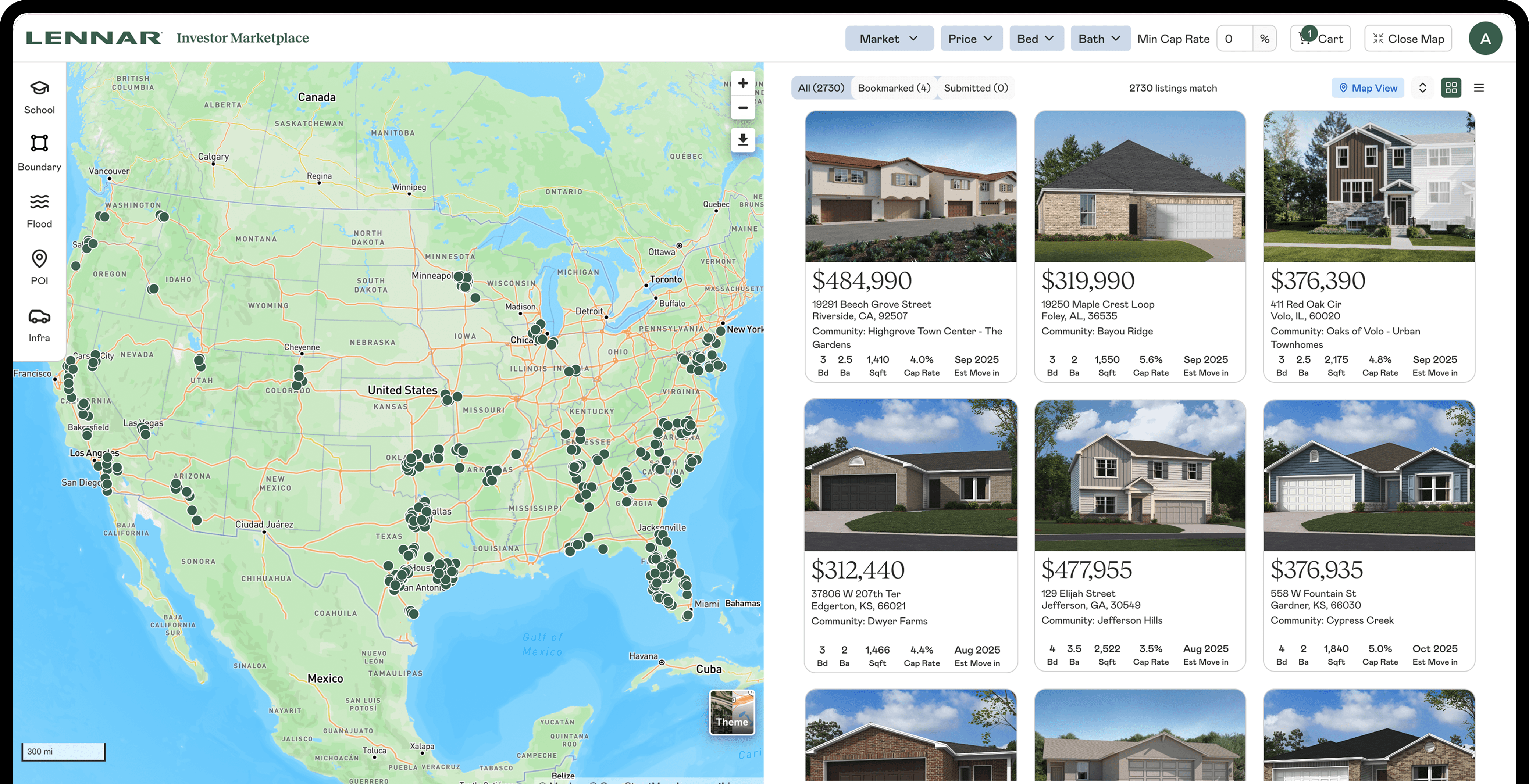
I also designed multiple layout views, including one allowing users to examine map and location-dependent features side-by-side. This gave investors flexibility in how they researched and let users see relevant data on one screen.

Result: No more switching between tabs.
Analysts revealed that investors in unfamiliar markets relied heavily on maps to understand neighborhood dynamics, while investors in known markets preferred the density of list view. Rather than choose, I designed for both workflows.
I split information-heavy features into separate sections and pages to minimize cognitive overload (as opposed to the infinite scroll method seen on sites like Zillow). Investor research follows a funnel: broad search → filter by criteria → save or place offers. I sorted relevant information into these stages accordingly:
Browse view: High-level property scanning with key metrics
Detail view: Comprehensive investment analysis for individual properties
Offer management: features for tracking saved or submitted offers

I reduced the cognitive load of processing 50+ properties at once by breaking the information into smaller packages appropriate for each stage.
Experienced investors often bid on multiple houses and buy the best deal, so I designed:
Bookmarks: Save properties and track price changes
Cart: Narrow to a shortlist before deciding
Submitted Offers: Easily keep records of favorable homes
Bulk Offers: Submit multiple offers at once with bulk review screen

This accommodates the purchasing patterns of experienced investors. In fact, even the smaller-scale investors placed orders in bulk, leveraging the responses of Lennar’s agents to further narrow down their choices.
By combining familiar real estate patterns with investor-specific features and integrated research tools, the platform enabled investors to move from discovery to offer in a fraction of the time.
The result was a success. Our marketplace was praised by news outlets and Lennar's CEO greenlit more resources to expand the project even further. In fact, in the first month, there were…
Throughout this project, I established a core design philosophy: familiarity over innovation. Previously, I focused on designing features that made a product stand out over others. However, for something as complex and ubiquitous as a marketplace, users want to dedicate energy to finding profitable properties, not learning new user flows. While innovation was a must for designing the investor-first features that make this marketplace stand out from others, thousands of other design decisions circled back to the industry norm.
The next stop for this marketplace is to further integrate the visual identity with lennar.com’s, making it almost indistinguishable as something built by another company. Version 2 is already on the way!
My current role on this project focuses primarily on keeping tabs on user analytics and presenting pertinent findings back to Lennar. It is through implementation of analytics services in Framer and Hotjar that many pivotal features were refined and will continue to be refined.